Feedback of website:
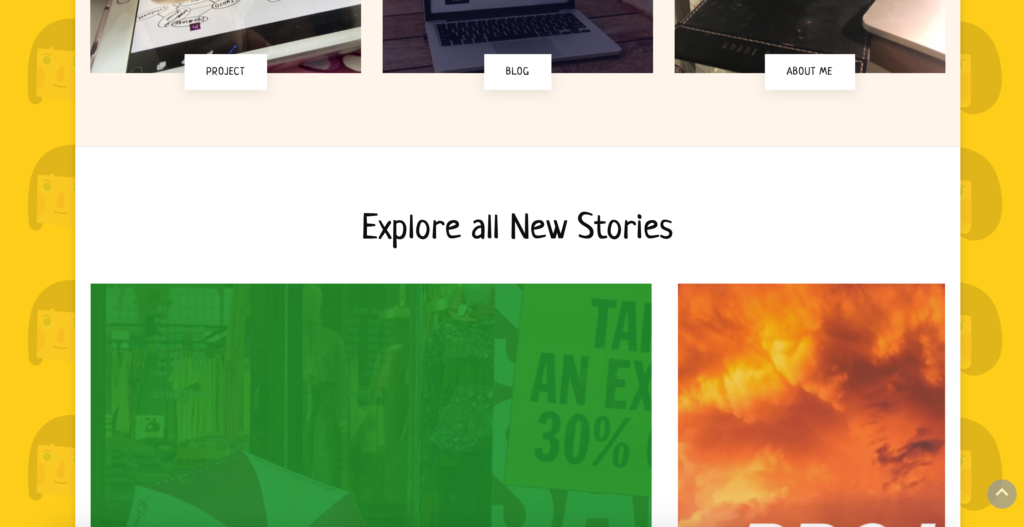
The explore all new stories section of the home page is a little redundant, because it only shows the title of the project, which is not helpful for understanding the content of the project. At the same time, it has a feeling of repetition.
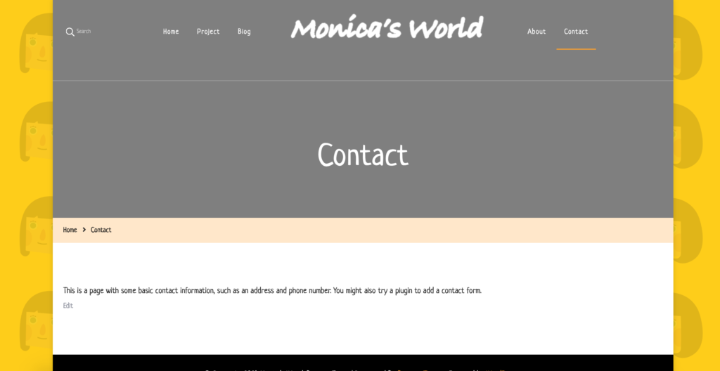
The contact section has not been set yet. I can set a page to contact readers.
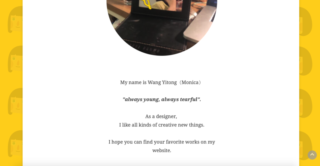
The “about” part introduces myself. Although it highlights personal characteristics, it doesn’t show the contact information of the website author, and it can’t leave a message. You can upgrade the content of this part to enrich the website. At the same time, the pixel of the photo is a little low, so you can iterate.
Feedback of blog:
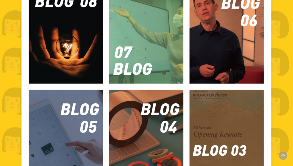
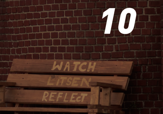
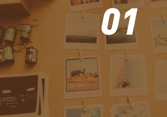
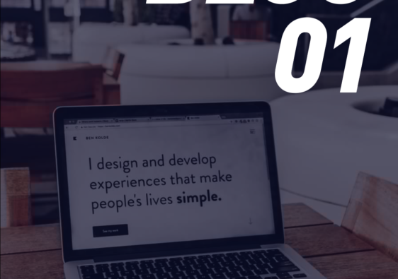
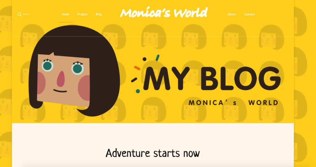
Blog pages form a series of covers, which are very uniform. At the same time, each blog have their own colour to enhance the vitality of the blog.Each article is matched with pictures, which is very readable.
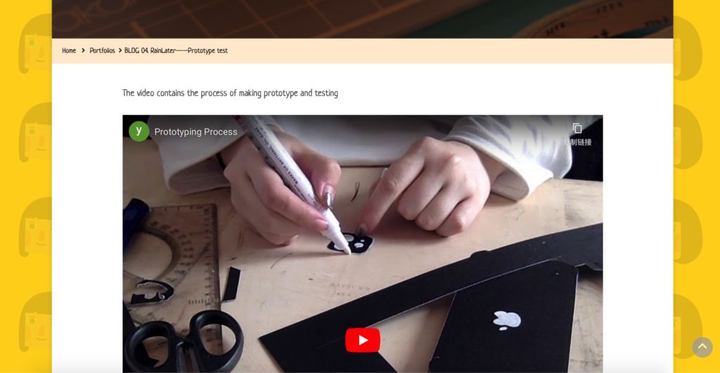
In terms of content, blog 4 synthesises the process and the final test into one video, so it takes people long time to watch. It can divide the test process and the prototype production process into two parts, each performing its own duties, which will make the readers watch and read more efficiently.
Feedback of project4:
The research is very detailed and rich in content, but it needs more visual output, which is a very interesting topic.
Changes I have made:
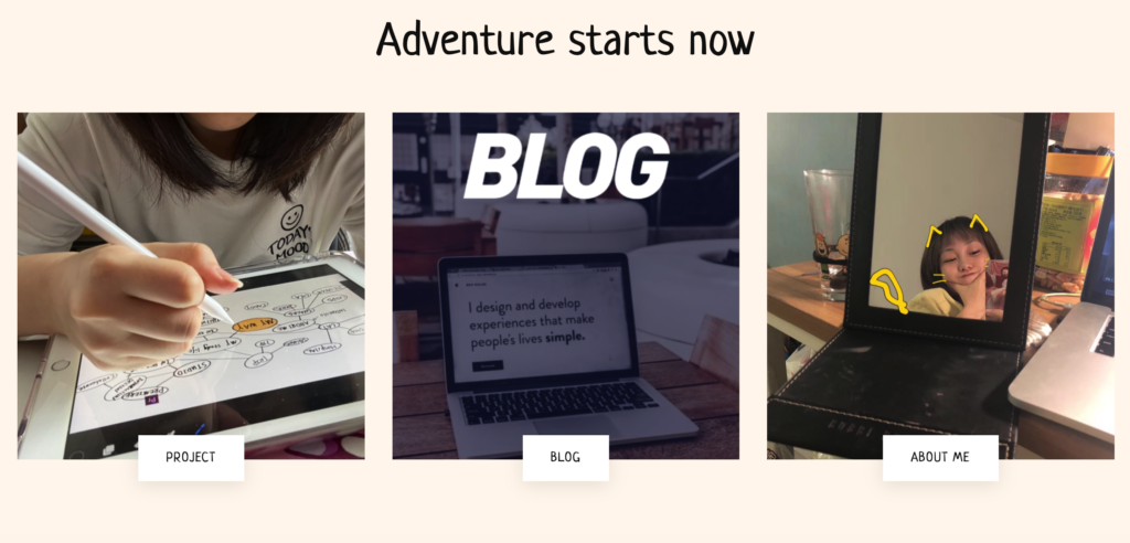
The homepage is divided into three parts: project, blog and about, which can find the desired content more clearly; After clicking, a new interface will appear instead of jumping, which will reduce the use of the return button and improve the viewing efficiency.
I choose to use personal self portrait illustration to improve website personality, which is interesting and readable.
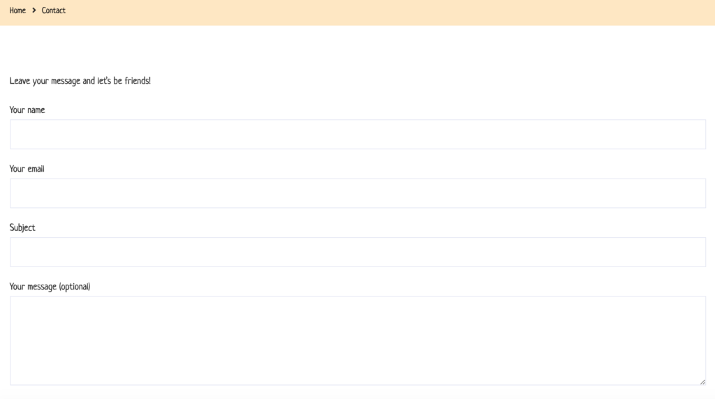
Then I updated the contact page, where readers can leave a message and leave their contact information
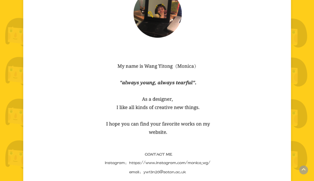
And I added personal information to the about page and upgraded the page layout,so the readers can contact me easily.
Published
2021/04/29 at 12:02 am