1. Brief
Through reading the brief of project 03, I understand that this project requires assuming that I have participated in the early design stage, making pact analysis and constructing user model according to my selected user group, and finally drawing wireframe and creating a physical prototype of my app for testing.
2. Secondary research
First of all, I did secondary research.
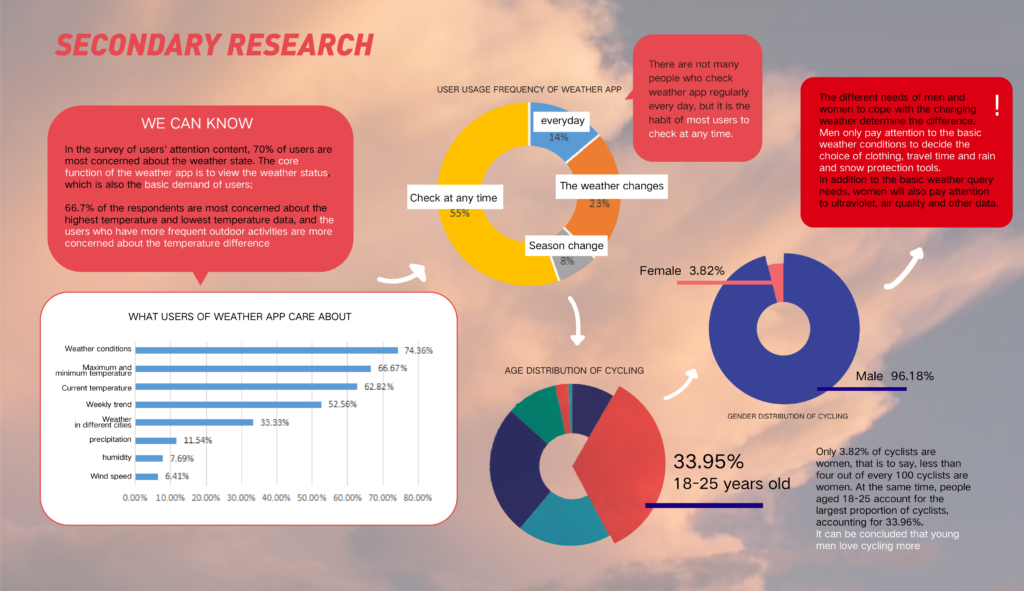
We can see that the most commonly used functions of people when using the weather app are weather conditions and the maximum and minimum temperature of the day, and users with more outdoor activities will use the app more frequently.
People can use the smart-phone to watch the weather at any time, which is very suitable for people who can’t watch TV weather report on time.
Let’s look at the data on cycling,Only 3.82% of cyclists are women, that is to say, less than four out of every 100 cyclists are women. At the same time, people aged 18-25 account for the largest proportion of cyclists, accounting for 33.96%.It can be concluded that young men love cycling more。
Finally, we can see that men’s concerns about the weather mostly lie in dressing according to the weather, planning travel time and preparing tools to prevent rain and snow.
3.Competitive products
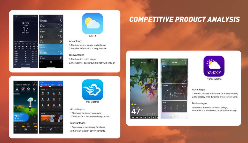
Next, I analyzed the competitive products. The first is apple weather, the second is Moji weather, and the third is Yahoo weather.
4.PACT analysis
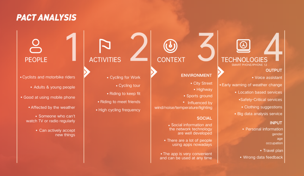
According to the content of the above research, I made a pact analysis.
5.Persona
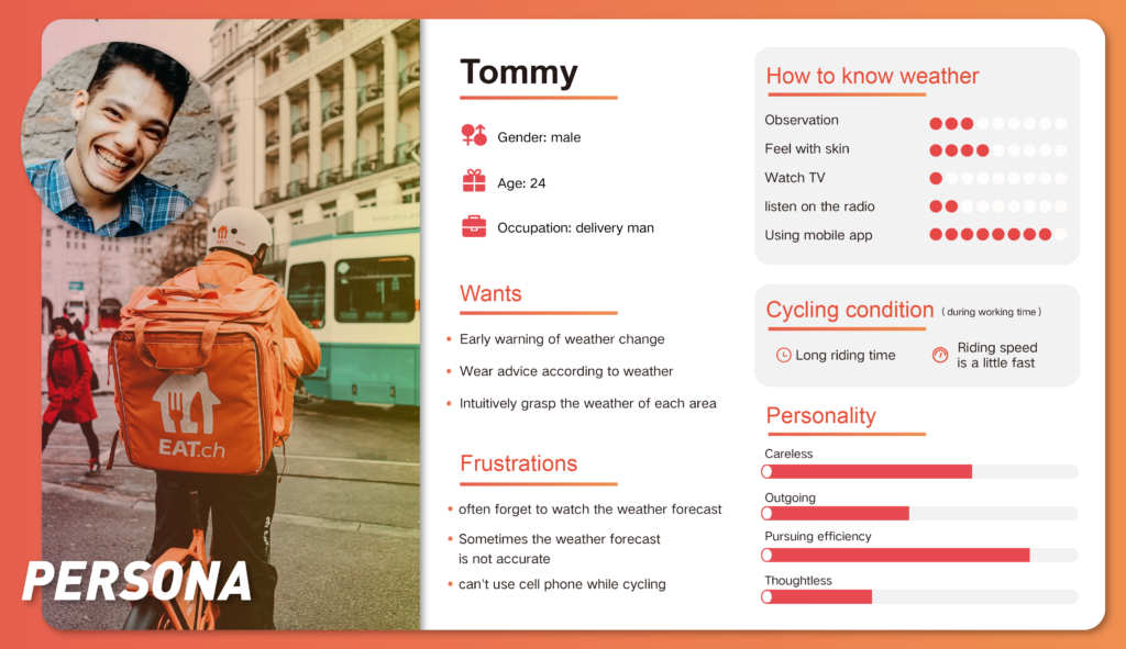
Then I made persona, and I positioned him as a young delivery Man,he is very careless and often forgets to check the weather, so he hopes to take the initiative to remind him to pay attention to the weather and give him clothing suggestions. As a delivery man, he pays great attention to efficiency, hoping to check the weather changes while delivering .Because he has been outdoor for a long time, the weather changes have a great impact on him, so he needs very accurate weather information Interest.
6.Sketching
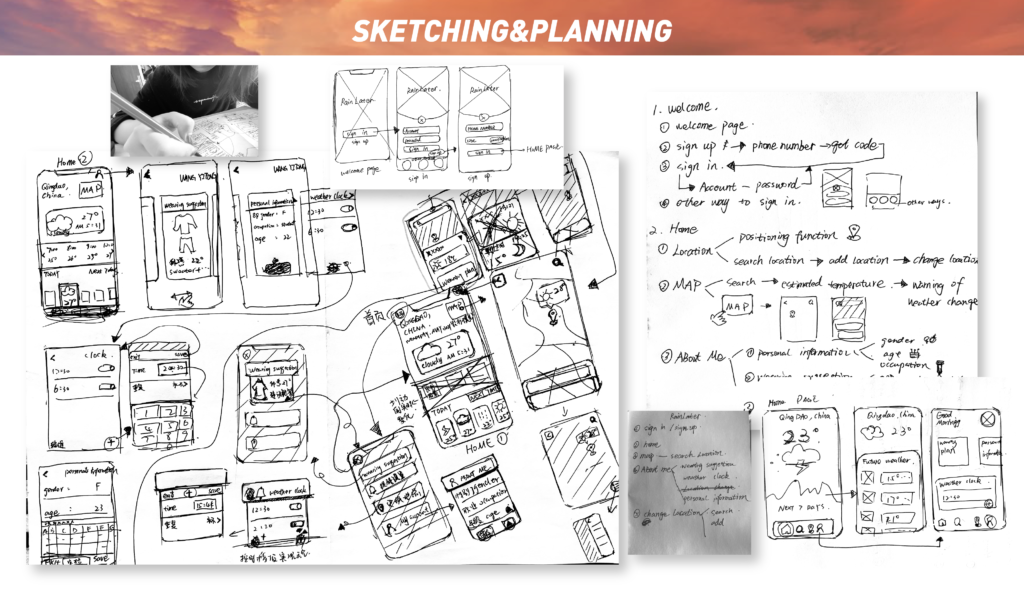
7.Preliminary flow chart
Next, I drew a sketch and arranged the preliminary flow chart according to the sketch.
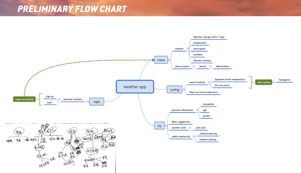
I divide the whole app into three parts: the home page, the ‘cycling’, and ‘my’.
The home page contains the display of weather information and the weather of other places;
The ‘cycling’ can display the weather of your place in real time, set the destination for navigation, and predict the weather conditions of the destination according to the estimated time of arrival and give advice before travel.
‘My’ contains personal information, clothing advice, weather alarm, and security monitoring
8.Roughly-rough wireframe
Then I drew roughly-rough wireframe.
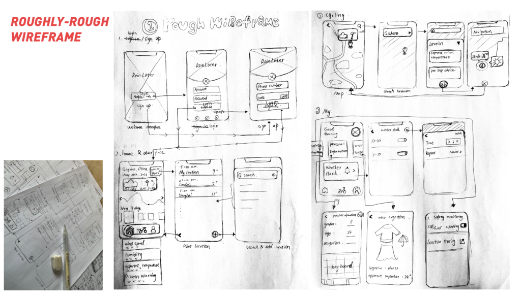
First is the welcome interface, and we can input the account and password to log in. If there is no account, you can use the mobile phone number to register and log in, and then come to the home page. The home page has all kinds of weather information. We can also click the button in the upper right corner to know the weather of other places, and then click the plus button to add new places to enter the list.
The next one is ‘cycling’. Click the icon to search for the location to get the relevant information. Finally, you can start to navigate and know your cycling conditions and weather conditions at the same time.
Finally, it’s about ‘my’. You can see age, occupation and gender by clicking personal information. This information can provide you with relatively accurate wearing suggestions. At the same time, it also has security monitoring. The most distinctive feature is the weather alarm clock, which can broadcast the weather at a fixed time. Click the plus button to add a new alarm clock.
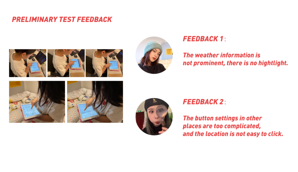
9.Preliminary test feedback
10.Updated flow chart (iteration)
Then, according to the test feedback and experiment, I updated the flow chart.
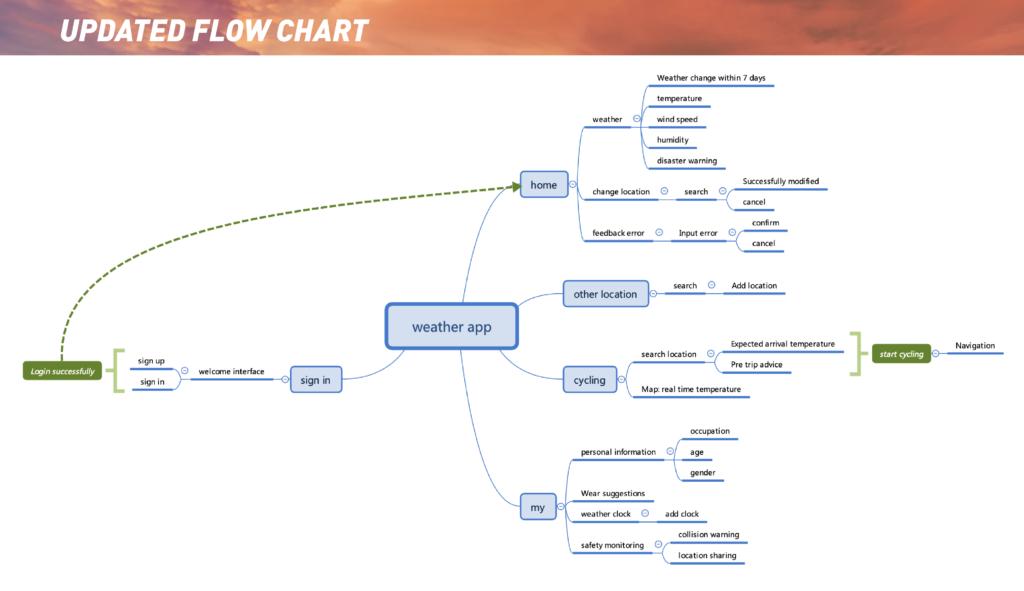
I divided the whole app into four parts, which are the home page, ‘other places’, ‘cycling’ and ‘my’. The home page added the function of changing the location and error feedback ,the function of other places which was in the home page before form a separate part now, other function did not change.
9.Precisely-rough wireframe
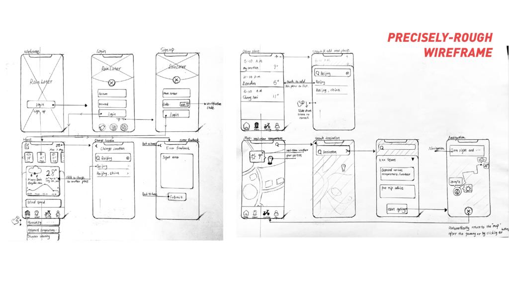
we can see that the login part has not changed. I have changed the display form of the home page.We can see that there are two interfaces for changing the location and feedback errors. In the next part, there are no changes in other locations. In the map part, we can see that I add the function to let users see the weather conditions of the destination in the navigation.
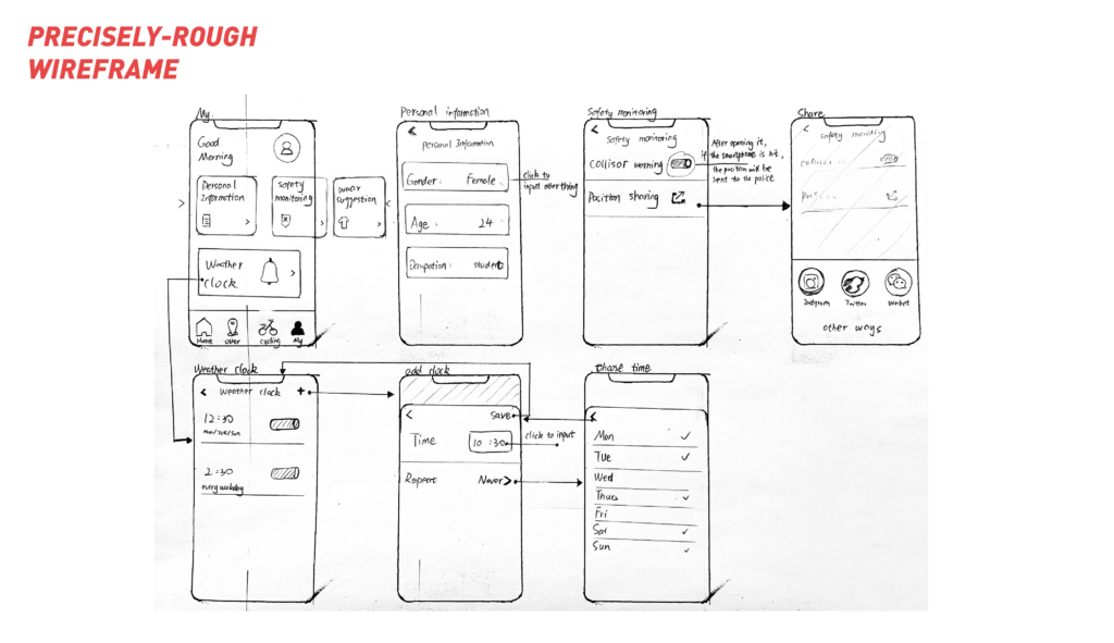
Finally, it is about ‘my’. There are no big changes,I just enriched the location sharing interface and weather alarm clock interface.
10.Prototype test(Final test)
Choose 720p to get a better viewing experience.
11.Prototyping Process
If you can’t watch the video, please click the link:
1.https://youtu.be/FfZkcKQa1iU
2.https://www.youtube.com/watch?v=7Mdc6TRh95Q
Thanks for watching!
